Working with the bPay by Barclaycard team gave me a massive opportunity to test myself. Designing the products concept and then seeing the physical product in person was an amazing experience. Although there were many learning curves for me along the way, from rejected designs to communication delays, it was a great experience to work with a massive corporate brand like Barclaycard.
In a lot less words (and I mean a lot), below is how the design process went.
Product Design | Packaging | Launch


After the initial product concept sample arrived from the factory in the Far East, a meeting was held with Barclaycard and the design was not approved.
”The product design needs to be more corporate”.

THE REDESIGN

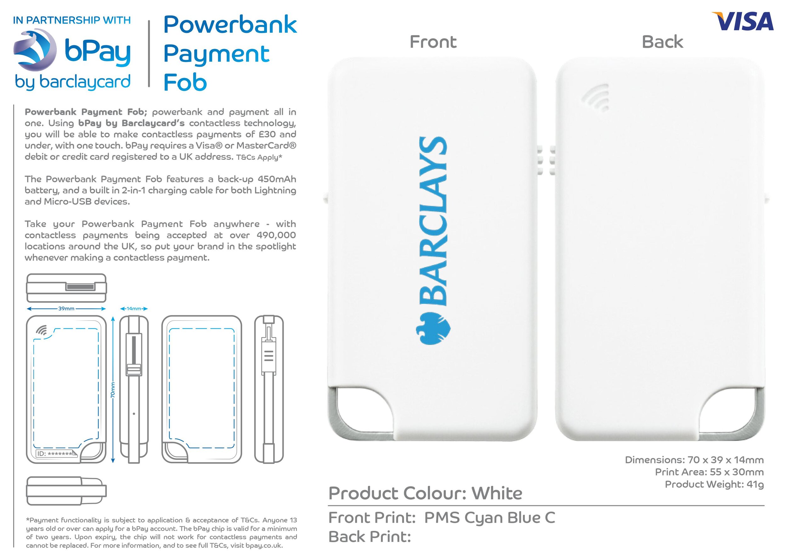
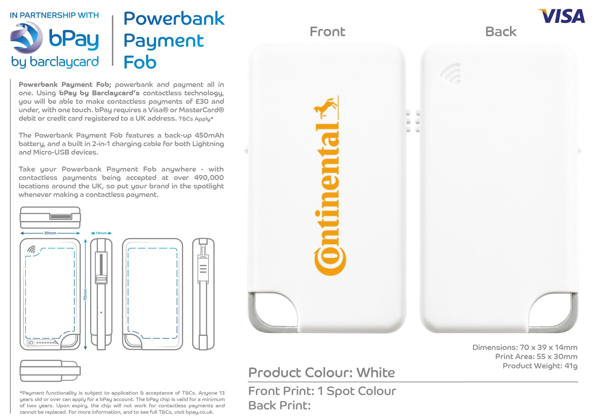
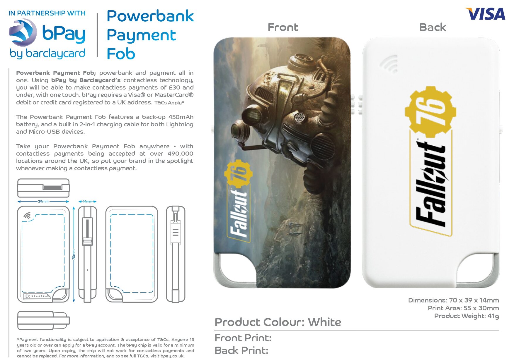
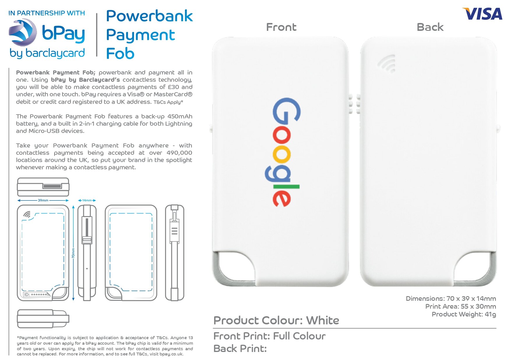
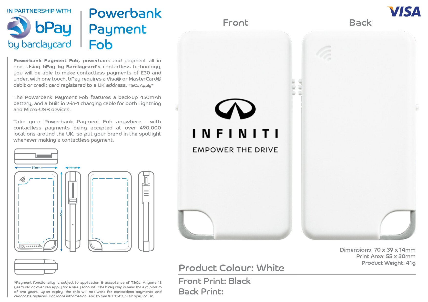
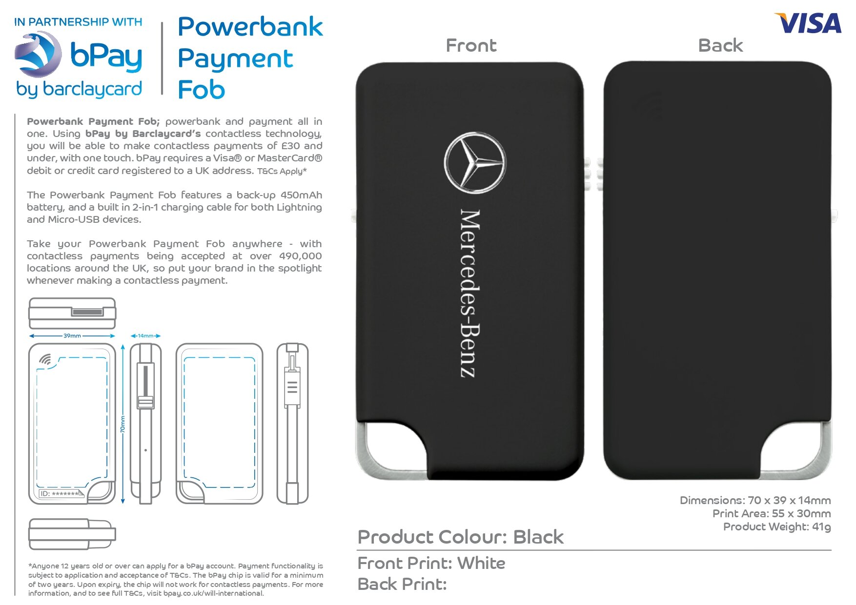
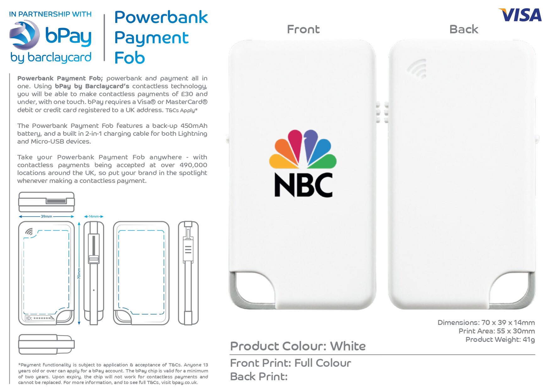
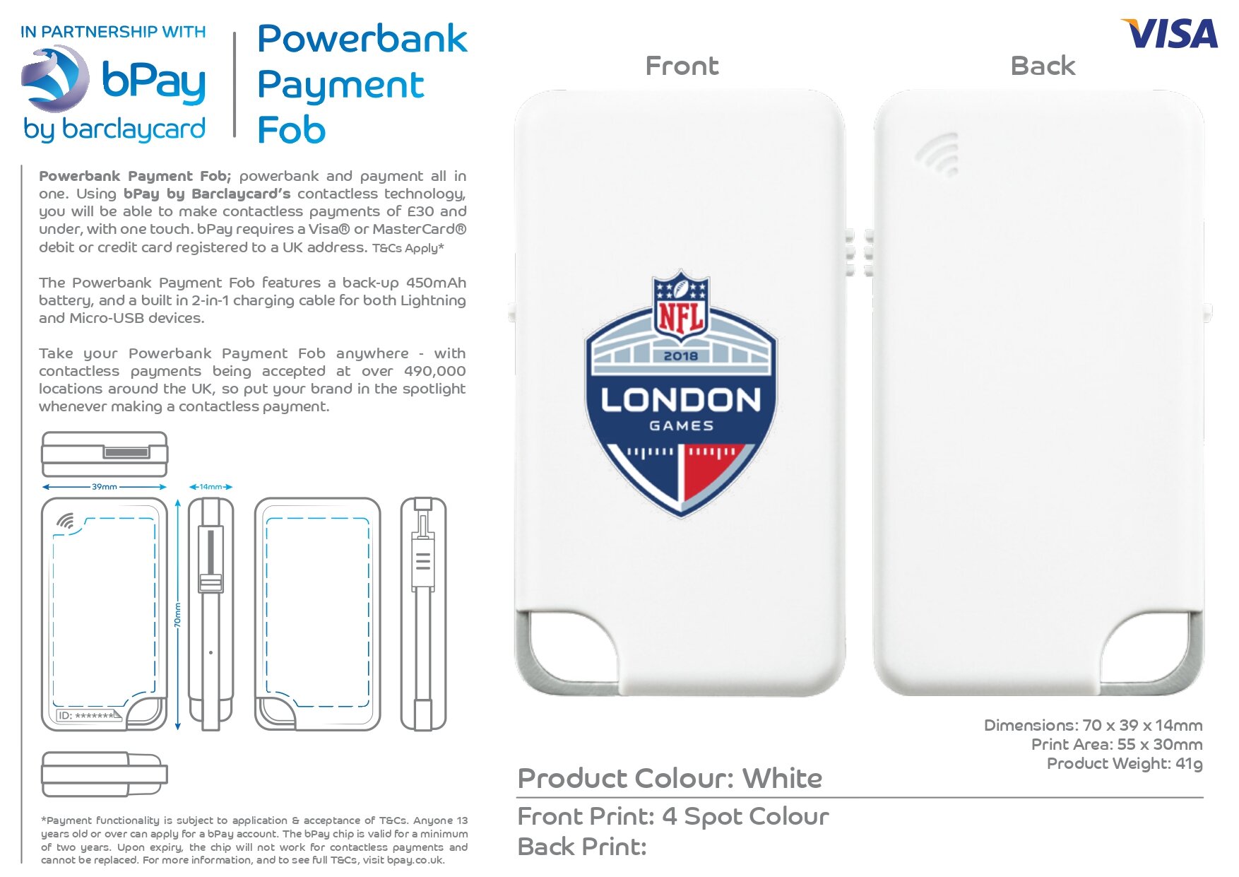
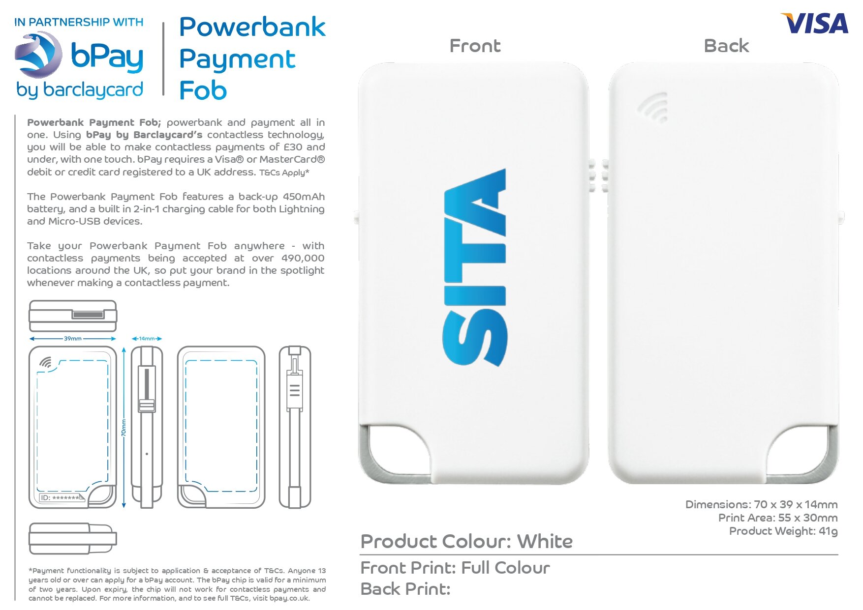
The Powerbank Payment Fob features a back-up 450mAh battery, and a built in 2-in-1 charging cable for both Lightning and Micro-USB devices.
70 x 39 x 14mm | 41g


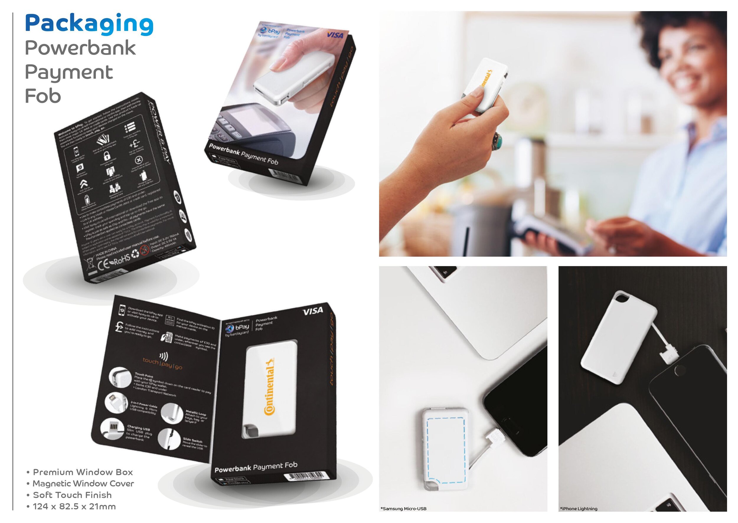
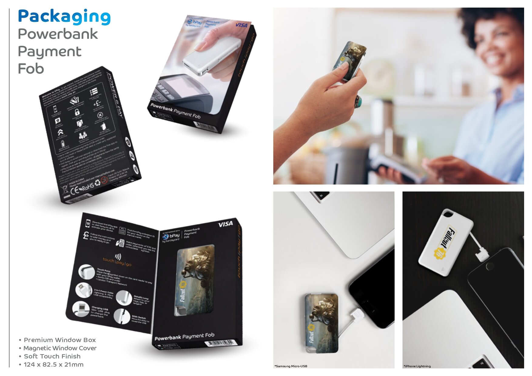
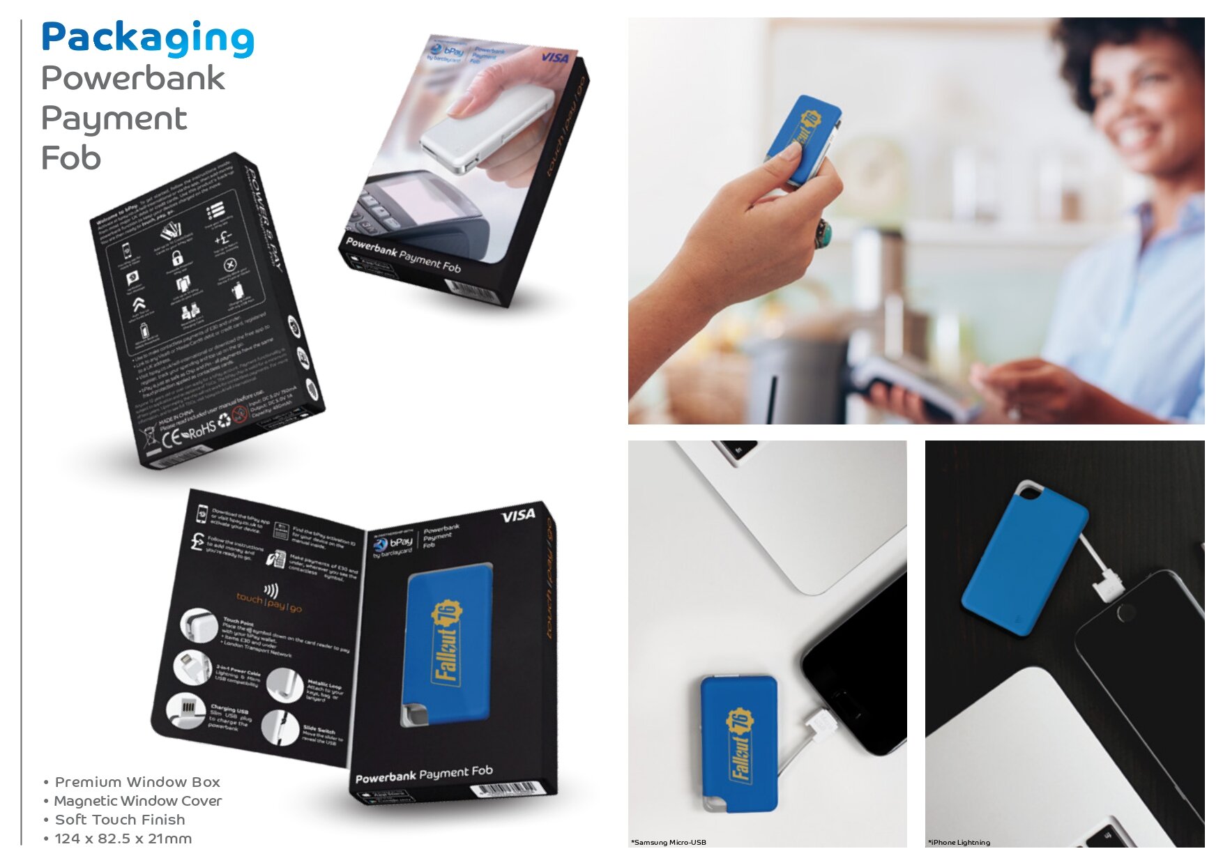
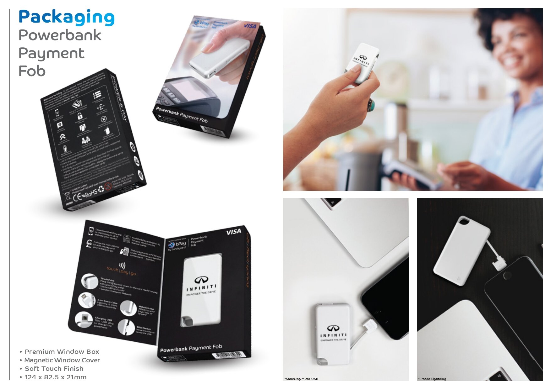
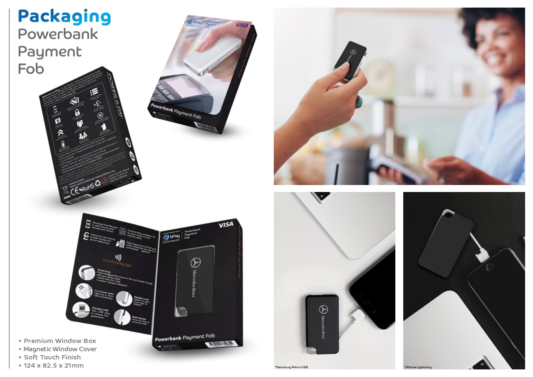
Packaging and Manual Design
The packaging and manual design was a difficult phase in the project. Each design had to go through a checking and approval process that took a few days. After a total of 11 different variations, the below was approved. Unfortunately, the packaging lacked any kind of personality or branding due to the unbranded promotional market standard.
Product Spec
The product spec was designed to give the customer a clear understanding of the product and it’s capabilities. It was also intended to sell the product, with the sales team emailing it to potential customers and using it in presentations as an introduction to the product and bPay service.


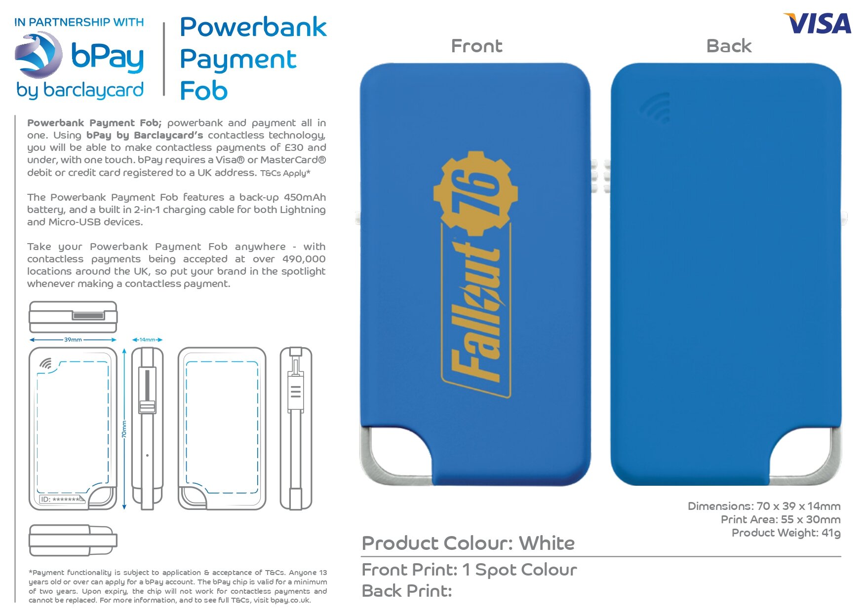
VISUAL PROOF
If the customer was interested in the product, a visual proof would have been made to give the customer an idea of how the product would look with the branding they decided to have. For example, Google could have had 5 different coloured products with their Google logo printed white.


Conclusion
Working with a massive corporate company like bPay by Barclaycard was a great experience- from the initial design process to the final product launch. Upon reflection, I preferred the look and feel of the first design. It felt seamlessly elegant, easy to use and more attractive to the eye, compared to the final design that looked clunky, complicated and underwhelming. Throughout this project I did learn how someones opinion can massively change the design of a project, and no matter how much effort is put into a design, it might not always be successful.
Around a year after our product was launched, the bPay app was discontinued and the payment concept was transferred to another existing Barclaycard app. Inevitably, the idea of wearable contactless payment tech was overshadowed by existing contactless payment apps like Apple Pay and Google Pay.